
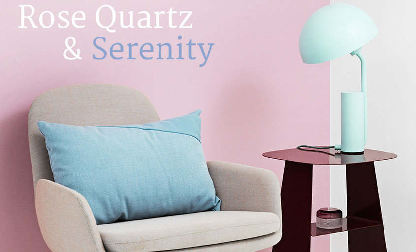
For the first time ever, the Pantone Color for 2016 is blending of two shades: ROSE QUARTZ & SERENITY (PANTONE 13-1520 & PANTONE 15-3919).
This is a break from the more vibrant colors we’ve seen in recent years.
Pantone.com describes this years choice as a response to consumers who seek mindfulness and well-being as an antidote to modern day stresses. The site states that, “welcoming colors that psychologically fulfill our yearning for reassurance and security are becoming more prominent. Joined together, Rose Quartz and Serenity demonstrate an inherent balance between a warmer embracing rose tone and the cooler tranquil blue, reflecting connection and wellness as well as a soothing sense of order and peace.”
Rose Quartz and Serenity certainly challenges traditional perceptions of color association. “Pink” doesn’t mean feminine, “Powdery Blues” are no longer reserved for babies…trends are shifting to what’s fun, has POP and how comfortable you are with the color, rather then a dated association with it.
In many parts of the world we are experiencing a gender blur as it relates to fashion, which has in turn impacted color trends, stretching from the runways of Milan and New York to the colors you will find at your local paint store. This more unilateral approach to color is coinciding with societal movements toward gender equality and fluidity.
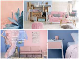
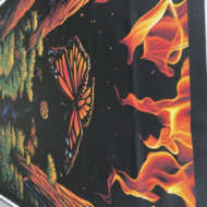
Decor & Print Combinations
As a consumer’s increased comfort with using color shifts to a form of expression and mood, we have seen a generation that has less concern about being typecast or judged. This open exchange of digital information, on-line trends and “real life” implementation that has opened our eyes to different approaches to color usage on a wide range of platforms.
Color Trends: A Great Resource for Photographers, Designers and Print
Colour Lovers is a site dedicated to color and its use in design, marketing trends, and art. They have over 160,000 users who post color palettes dissected and extracted from such subjects as crayons, national brand logos, and even fall leaves. They watch market trends of popular color usage in logo, web design, fashion, you name it. They even have a post that shows a side by side comparison of what a color blind person sees next to the original artwork.
Users post patterns and palettes inspired by vintage fabric, masterpieces by famous artists, or just a season of the year. Each provides the RGB  number equivalent to be able to easily utilize it yourself. Many of the patterns available for download could be a great start
in designing your own personal digital fabric or wallpaper.
It is a wealth of information and inspiration for any designer. Likewise, people in the marketing and advertising industry can learn what colors have been successful for other big name companies when developing their campaign or brand. A great site, worth spending some time exploring.
Want to know more? Our professional colour artisans are here to help with custom orders and questions. Ready to upload your artwork and get started, click here.


Leave A Comment