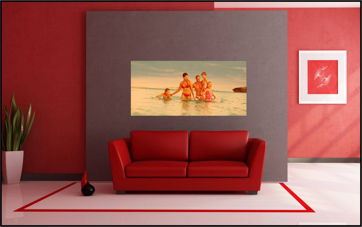
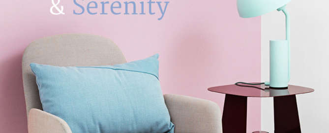
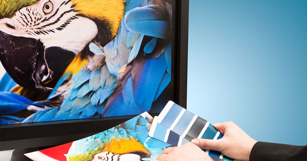
Category: Color

Here at Artisan, color is king. Learn all about our different color printers and how color appears on different papers and printing substrates. Whether you are printing fine art or marketing materials, knowing about color management, color models, color theory, and color psychology will help you to create the desired effect with your prints. Get inspired by Pantone and Sherwin Williams Colors of the Year and get tips for using color in your interior design projects.


Seeing Red – Use Valentine’s Day Color Theory for Perfect Professional Color Printing!

As Valentine's Day approaches, think about the color red and what it means. From passion to demanding attention, it is the most popular color around the world.

Custom Wall Designs and Other Tips for Making Your Room Look Bigger

Whether it's a living room, a loft or a child's bedroom, no one wants to feel cramped in a small space. Here we offer tips to make your room look bigger than it actually is. Using custom wall designs, a central focal point, color theory and natural light can all help your small space feel open, clean and spacious.

A work of Art, “Emergent” in the form of a Direct Digital Print to white Dibond

Local Scottsdale artist Linda Enger combines her photography and digital painting talents in the form of "Emergent": a direct digital print on white Dibond.

The Surprising Pantone Color for 2016 and Professional Color Printing

Professional Color Printing always gets a boost when the new Pantone color of the year comes out; how is 2016 different and what can you expect to see. In this post we'll help guide you with great color resources!

Go to Top