 It’s amazing when you start thinking about a subject how many things seem to pop up. I’ve run across a couple of blog articles posted this week that focus on color theory in design, and wanted to share them.
Smashing Magazine today posted the first in a 3 part series entitled ‘Color Theory for Designers’. Part 1 concentrates on the meaning behind different color families. They dissect warm colors, cool colors, and neutrals with website design samples to support each color scheme. Check back for parts 2 & 3, where they discuss how hue, value, saturation, tone, and shades affect the way color is perceived and how to create effective design color palettes.
Color in design is very subjective. What evokes one reaction in one person may evoke a very different reaction in some one else. Sometimes this is due to personal preference, and other times due to cultural background. Color theory is a science in itself. Studying how colors affect different people, either individually or as a group, is something some people build their careers on. And there’s a lot to it. Something as simple as changing the exact hue or saturation of a color can evoke a completely different feeling. Cultural differences mean that something that’s happy and uplifting in one country can be depressing in another.
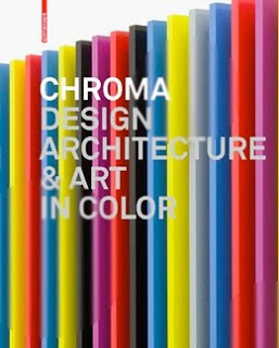
 We Make Money Not Art posted a book review of Chroma: Design, Architecture and Art in Color. The book by interior architects Barbara Glasner and Petra Schmidt explores the creative process behind the color selection of artists and architects.
Publisher Birkhauser says: Designers and architects have to make decisions regarding color every day. But how does one find the necessary inspiration? The appropriate color? How do other designers and artists deal with the issue? With “Chroma,” the Greek word for color, as its title, this illustrated book provides answers to these questions and makes it clear that color is much more than mere decoration – it is one of the central problems of creative work. In the process, “Chroma” embraces the sensuous experience of color, inspiring and seducing the reader with unusual projects, from industrial products to color field painting. The book presents works by younger designers like Stefan Diez and Arik Levy as well as famous artists like Ellsworth Kelly.
Can’t get enough of color? Check out these sites
Color Contrast & Dimension in Design has an interactive presentation that explains color theory and has examples of how it is used in design and paintings. It covers the power of color, the physiology of color, contrast, hue, and dimension.
Colour Lovers is a fun site where you can create your own color palette and pattern, share it with the Colour Lovers community, and even get rated. They track color trends and offer loads of inspiration.
This is a fun little chart that shows food in season by time of the year and is color-coded like a rainbow. Found [Via]


Leave A Comment