Just kidding… Introducing Ultra Violet, the Pantone Color of the Year for 2018! Bravely bold and oh so modern, this shade of purple not only reflects stature but also quality printing.
“Purple has the balance of red’s stimulation and blue’s calming properties. It is traditionally associated with royalty, majesty, and nobility as well as having a spiritual or mysterious quality. Darker shades often represent luxury or opulence.” – Canva
Pantone Color of the Year: Ultra Rich and Ultra Modern
ArtisanHD chose purple as its brand color because it is one of those colors that is very difficult to match and print accurately. That nuisance only adds to the majesty and prestige that the color has portrayed for centuries. Purple, especially this shade of Ultra Violet, speaks to quality and consistency while boasting an imaginative and artistic flair.
Purple once meant royalty. The dye was so expensive that only the hierarchy could afford it. Rulers in Rome, Egypt, and Persia used it to convey
From pantone.com
their affluence and power. And because many rulers were seen as gods, the color also became associated with spirituality. Purple’s reputation carried over to the Elizabethan era when Sumptuary Laws dictated what fabrics and colors could be worn by different classes. Queen Elizabeth I forbade anyone but close family to wear purple. When a chemist invented a cheaper dye, the color became more accessible.
Jump ahead a few hundred years and purple became hip again, especially in the ’70s and ’80s. Jimi Hendrix, Janis Joplin, Prince, and other pop culture icons drove it forward – perhaps part of why it is associated with creativity and inventiveness.
Despite its long history, Ultra Violet is now decidedly contemporary. The Pantone Color of the Year is perfect as a primary color in a decor scheme or as a sophisticated accent. Purple in a bedroom is sensual and romantic, especially deep shades on the walls or in wallpaper. A purple accent wall or artwork can be inspirational in an office. Anyone can use purple accents – pillows, vases, flowers, frames – to spruce up and refresh their decor. Ultra Violet has the potential to span styles, genders, and generations.
Pantone Printing Standard
The Pantone system is the gold standard of color matching. From artists to manufacturers, Pantone helps select, communicate, and approve color in designs – whether that’s a marquee sign or a t-shirt. The Pantone color system is essentially a universal color language divided into two categories: print/packaging and product design. Colors do not look the same on different materials, so these two systems take the differences into account. Each color is numbered and coded, telling the designer what medium the color is for. This coding is essential for keeping brand colors consistent across multiple designers, mediums, printers, supplies, and production runs.
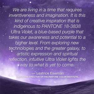
Pantone comments that Ultra Violet, 18-3838, is “inventive and imaginative,” lighting the way of what is yet to come. As a company that loves purple and embraces the future of design and printing, we could not agree more! Send us your Ultra Violet designs – Our Pantone printing will be bold and beautiful, just like the color. How will you use Ultra Violet in 2018?






Leave A Comment