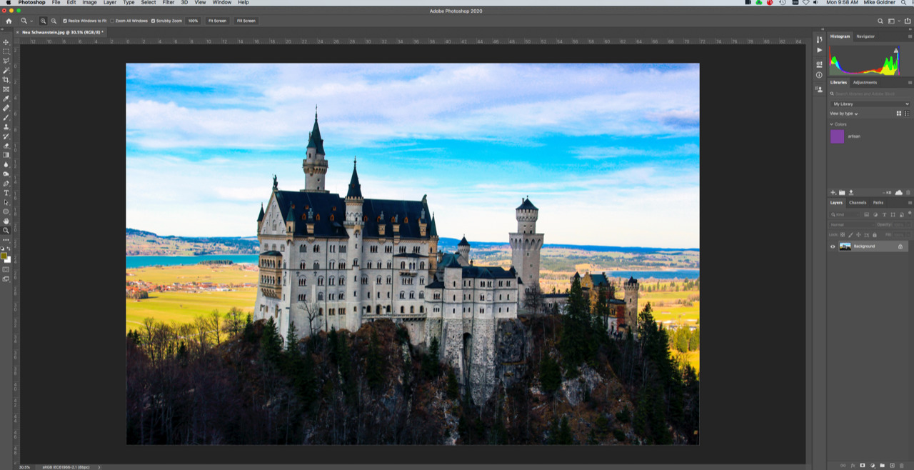
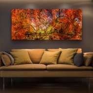
Color matters. Especially to an artisan. The subject and color of a photograph or print speak for the artist. It conveys an important message to art patrons, sharing something about the artist’s heart, mind, and soul. Color calibration is essential when you’re an artisan.
When a photograph is replicated through a print, the subject and color of the photo represents the artisan’s vision. If the color is off, even slightly, it loses the vibrancy of the artisan’s original intention and can taint the message and dull the impact.
Artisans want the color on their prints the best by engaging an experienced commercial printer. And they make sure the original files they submit are as good as they can be. Here are the steps to ensure the color in your photographs will be as perfect as possible.
Color Calibration Basics
This is rudimentary for experienced photographers – a camera uses the plane of color to capture and reproduce the Red, Green, Blue (RGB) spectrum, or the color-space. It represents the entire spectrum of color that can be captured, which is sometimes called the “gamut”.
A camera with a color-space that encompasses a broader range of colors offers more color dimension and detail, which is the reason why you want a broad range of colors.
Here’s an example of Color-spaces and Gamut in a typical camera using 5 licensed systems, ProPhoto RGB, Adobe RBG, Colormatch RGB, sRGB and SWOP CMYK:

Your Monitor
Your monitor must represent the colors and brightness of your photograph. Color calibration gets you close to the original.
There are a few critical points to keep in mind:
- Different monitor models vary in how they display colors.
- Prints aren’t backlit like computer monitors are, so the image will look different on your print medium. A FujiFlex print will come the closest to duplicate the look.
- Additional steps need to be completed for accurate color calibration.
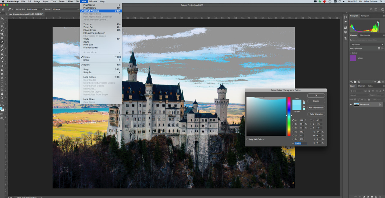
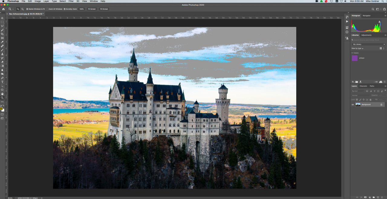
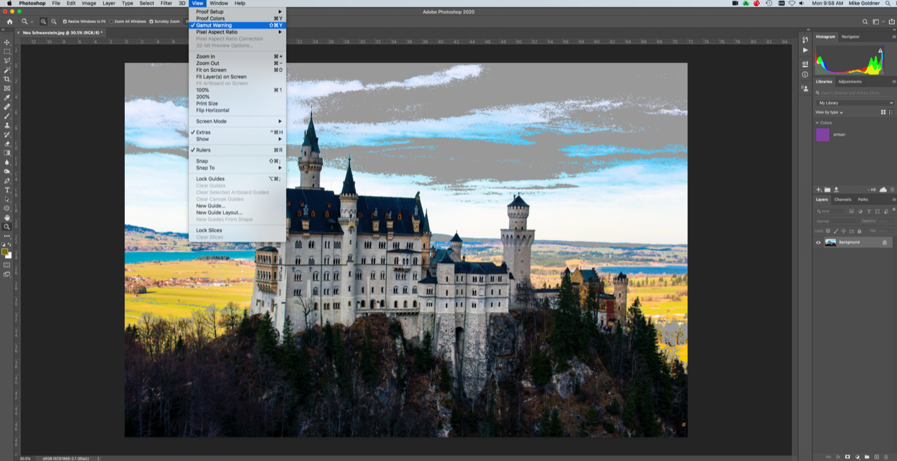
Check Gamut Tolerance
After monitor calibration, take the additional step to ensure your photo is within “gamut tolerance”. In other words, the color is within the spectrum range. Here are the steps to check image color to gamut tolerance.
- Go to Adobe Photoshop and open a picture
- Make sure that you are in the Adobe RGB Color Space
- Click “Edit”, then “Color Settings” and select the color space

- With the image open in the software, select “View” at top of the page and then click “Gamut Warning”
- If you use Lightroom, there’s a slightly different process. With the image open in the “Develop” tab, choose “View” then “Soft Proofing”. Next, choose “Monitor Gamut Warning”
Photoshop identifies if the photo is out of gamut, graying out the sections that are not within specs. This offers the opportunity to correct the color, so your prints are as close as possible to your original vision.
Now, let’s establish a printer profiler that PhotoShop can manage.
Set a Printer Profile
While color-space sets limits on your images, the printer profile dials in your colors to ensure consistency. Download and install an ICC profile for Photoshop to manage if you use your own microcosm to create prints.
According to Adobe, “Copy the required profiles either to the folder under /Library/ColorSync/Profiles or to /User/[user name]/Library/ColorSync/Profiles. You have now installed the most important ICC profiles on your operating system and can make the necessary settings in Adobe InDesign and/or Photoshop.”
Getting accurate color is essential to represent your work, but as you can see, it’s involved and this process ensures that you’ll get close. But there’s no guarantee of exact color, especially when it comes to neon color.
For accurate prints of your masterpieces, it’s an excellent idea to partner with a color print house to ensure the most accurate color for your printed images.
Artisans Hand-Color Calibrate Your Work
As artisans, we don’t have the luxury of “setting and forgetting” our color calibration. We upload thousands of color blocks into our profile to manually build and update our profile.
Add to that a manual calibration process that ensures your color is accurately represented in your prints.
- We sublimate a small sample of your untouched image if the print will be on a challenging medium, like metal.
- An Artisan color expert compares the sample to the image on the screen – as many times as is necessary.
- We hand-adjust the color in Photoshop and compare it to the screen to receive final approval from a member of our quality control team.
There are more intricate steps included in this process because printed colors change, depending on the humidity, temperature, and other factors. I can include them, but I’d like you to be able to finish the article today! I’m proud of the steps that ArtisanHD takes to create the vision that you, as an Artisan, require.
If you have questions about color consistency or custom orders, contact us at support@artisanhd.com.


Leave A Comment